WiFi that is self-powered, decentralised and green.
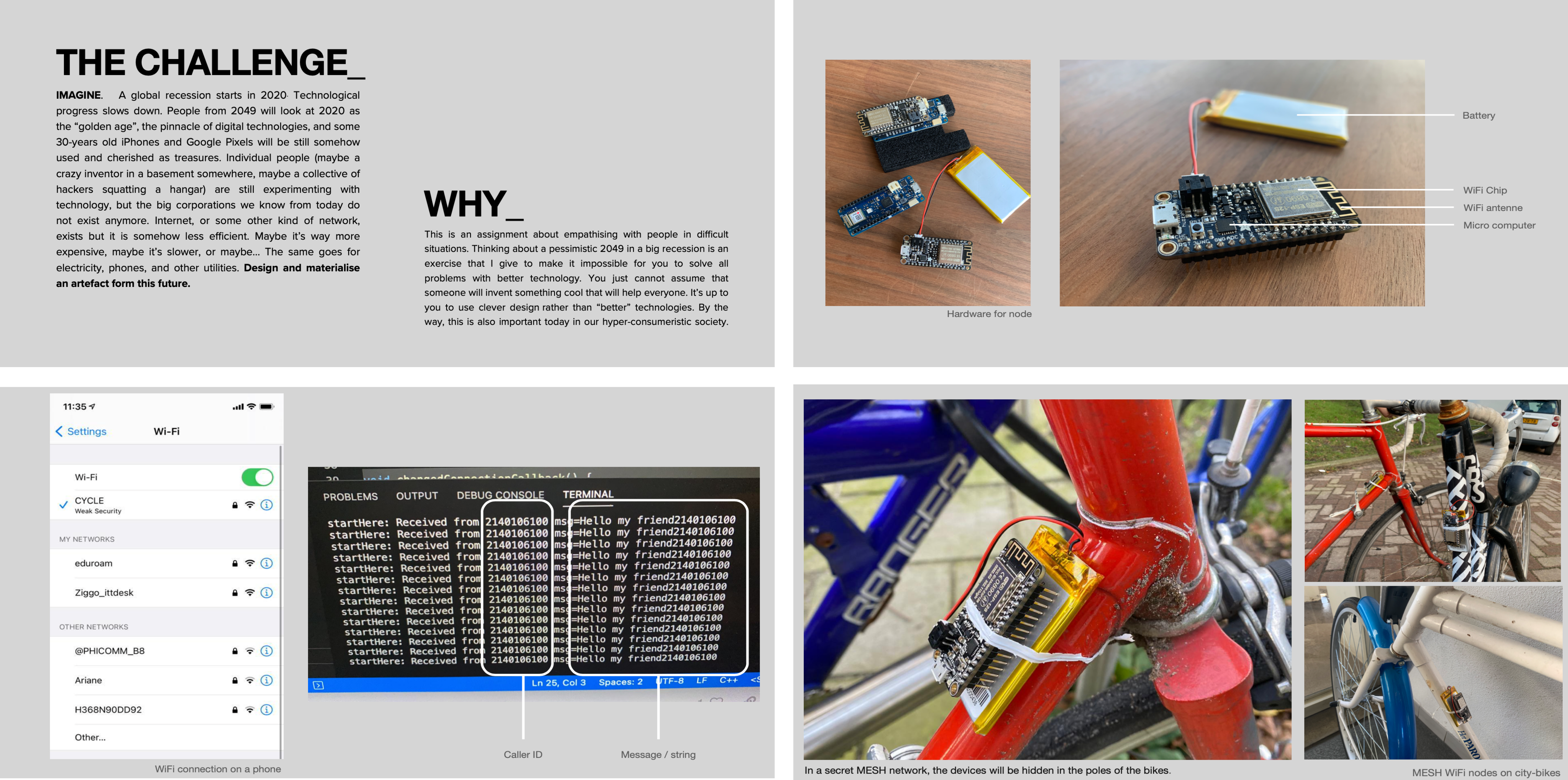
What if... we got interconnected WiFi nodes placed on bicycles and spread across the city, resulting in a completely decentralized MESH network. Fully self-sufficient and green-powered due to the dynamo charging battery connected to the bikes.
Client
︎︎︎︎︎︎︎︎︎︎︎︎︎︎︎︎︎︎︎︎︎︎︎
Ladies that UX
︎︎︎︎︎︎︎︎︎︎︎︎︎︎︎︎︎︎︎︎︎︎︎
Ladies that UX
Tags
︎︎︎︎︎︎︎︎︎︎︎︎︎︎︎︎︎︎︎︎︎︎︎
Speculative Design, UX/UI, Product Design
︎︎︎︎︎︎︎︎︎︎︎︎︎︎︎︎︎︎︎︎︎︎︎
Speculative Design, UX/UI, Product Design

CASE STUDY
Challenge
Imagine a fictive future in which there is a global technological recession. Design an artifact for this future.
Solution
A future like this – in which one cannot rely on a steady network provided by multinationals – requires a bottom-up solution:
Interconnected WiFi nodes will be placed on bikes, spread across the city, resulting in a completely decentralized MESH network. It will be fully self-sufficient and green-powered due to the dynamo charging battery connected to the bikes.
Competitor research
CYCLE combines bicycles and tech. Which isn’t new, in a country where where e-bikes are taking over the roads. I figured I should first look at how others have set up their websites. This was also useful to get a general sense of the different parts of a commercial site and get used to UX terminology. See the competitor research below.
CYCLE combines bicycles and tech. Which isn’t new, in a country where where e-bikes are taking over the roads. I figured I should first look at how others have set up their websites. This was also useful to get a general sense of the different parts of a commercial site and get used to UX terminology. See the competitor research below.

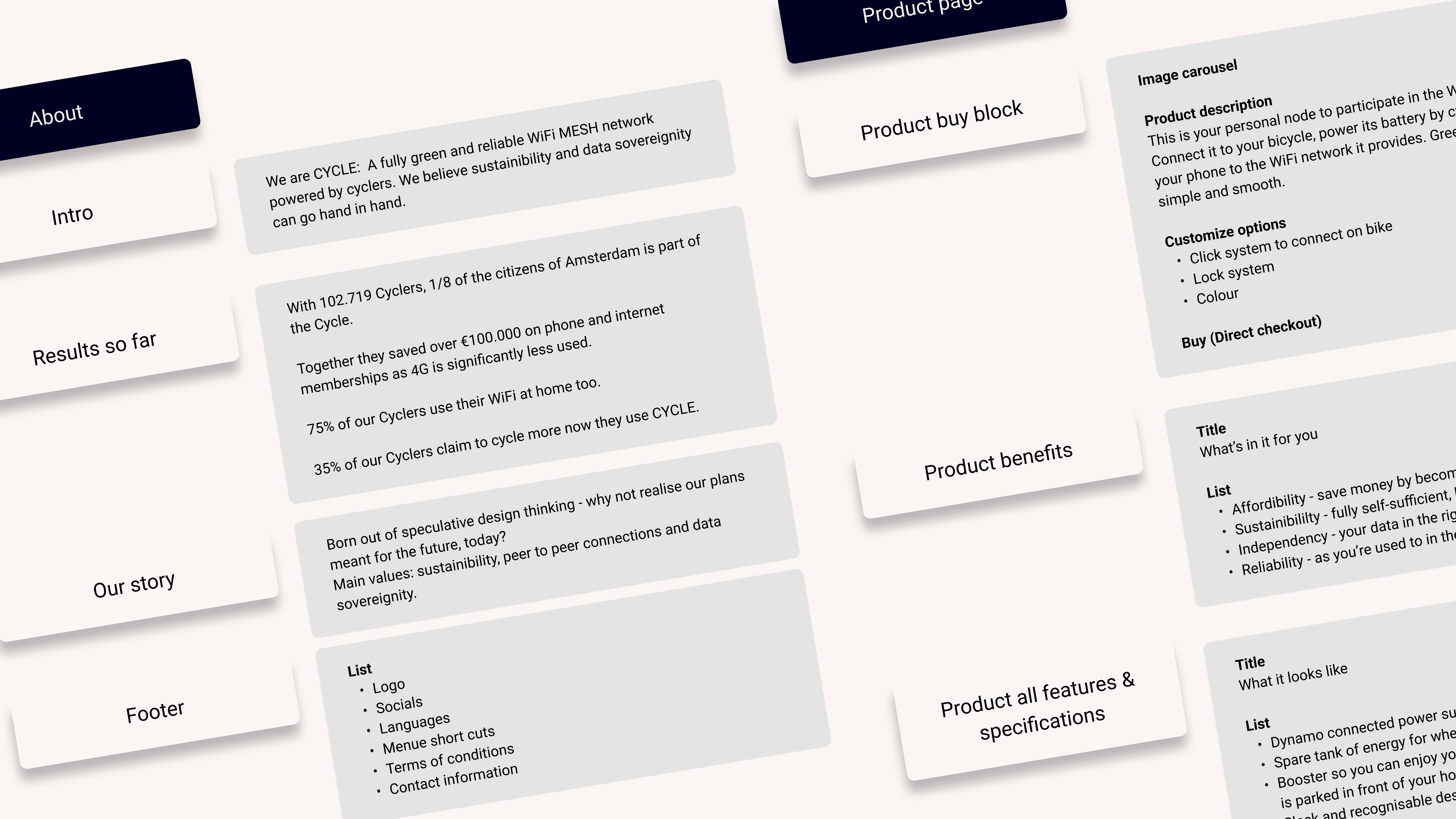
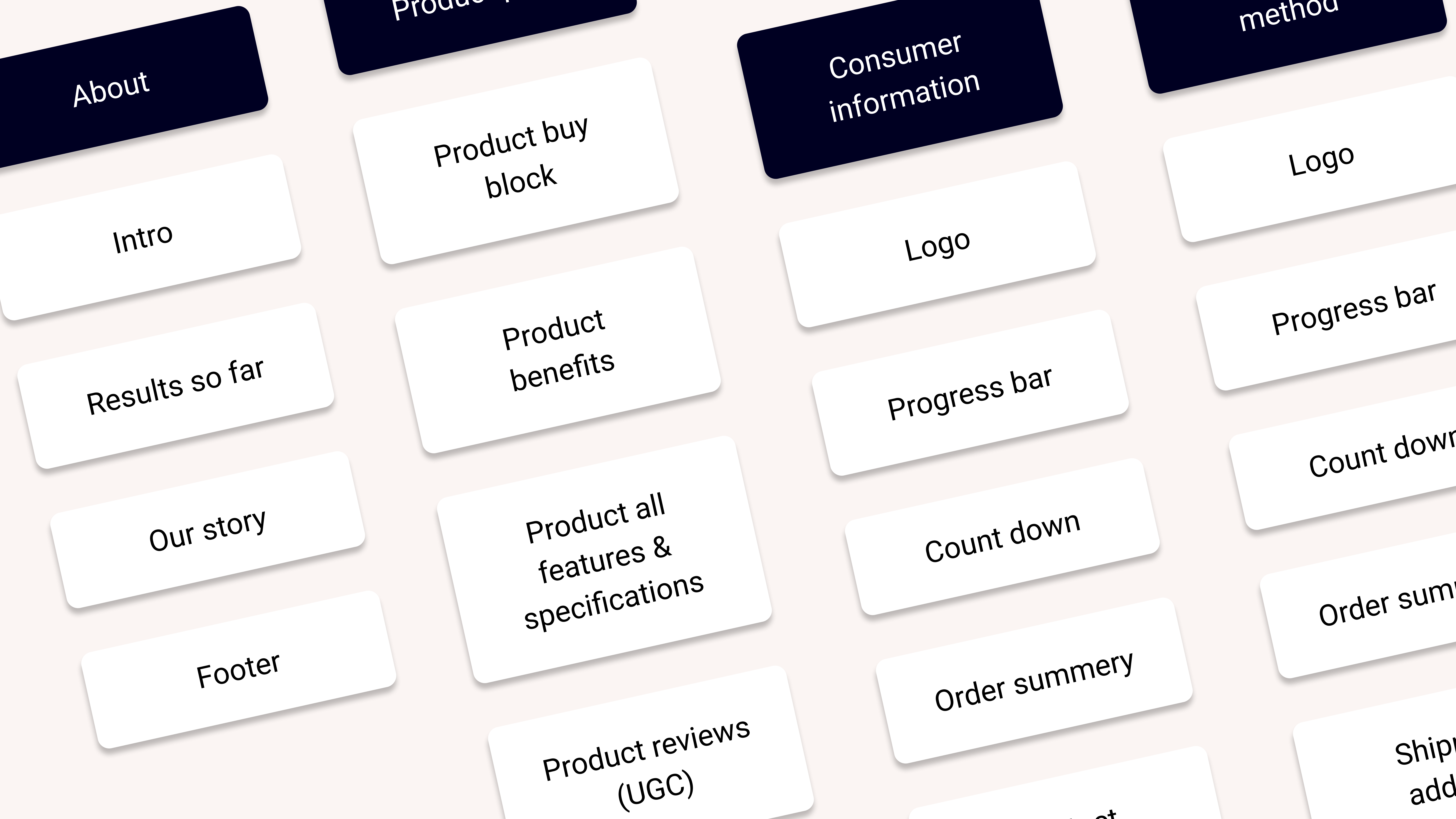
Sitemap
Based on the competitor research, I set up a sitemap with the parts my website would need. Let’s look at some of them in more detail.
Live map
Adding a live map to the homepage seemed like a good idea as it immediately shows the collectiveness and liveliness of the community around the product.
Collabs
One of the things that makes a product trustworthy is recognition from other brands. Ideally, CYCLE collaborates with businesses such as Swapfiets.
About page
As not everyone would be familiar with the technicalities of a mesh network, I figured it needed some explanation on the ‘about page’. Another great benefit of an about page is the sense of identity it creates for the brand.
Priority guides
Part by part, I filled in what these sections would look like in more detail. Adding actual copy would help me later in the process when I set up wireframes. Besides, writing down what content would actually look like gave me an idea of the space and placement it needs on the website. It’s seemed better than working with placeholders and Lorem Ipsum copy.
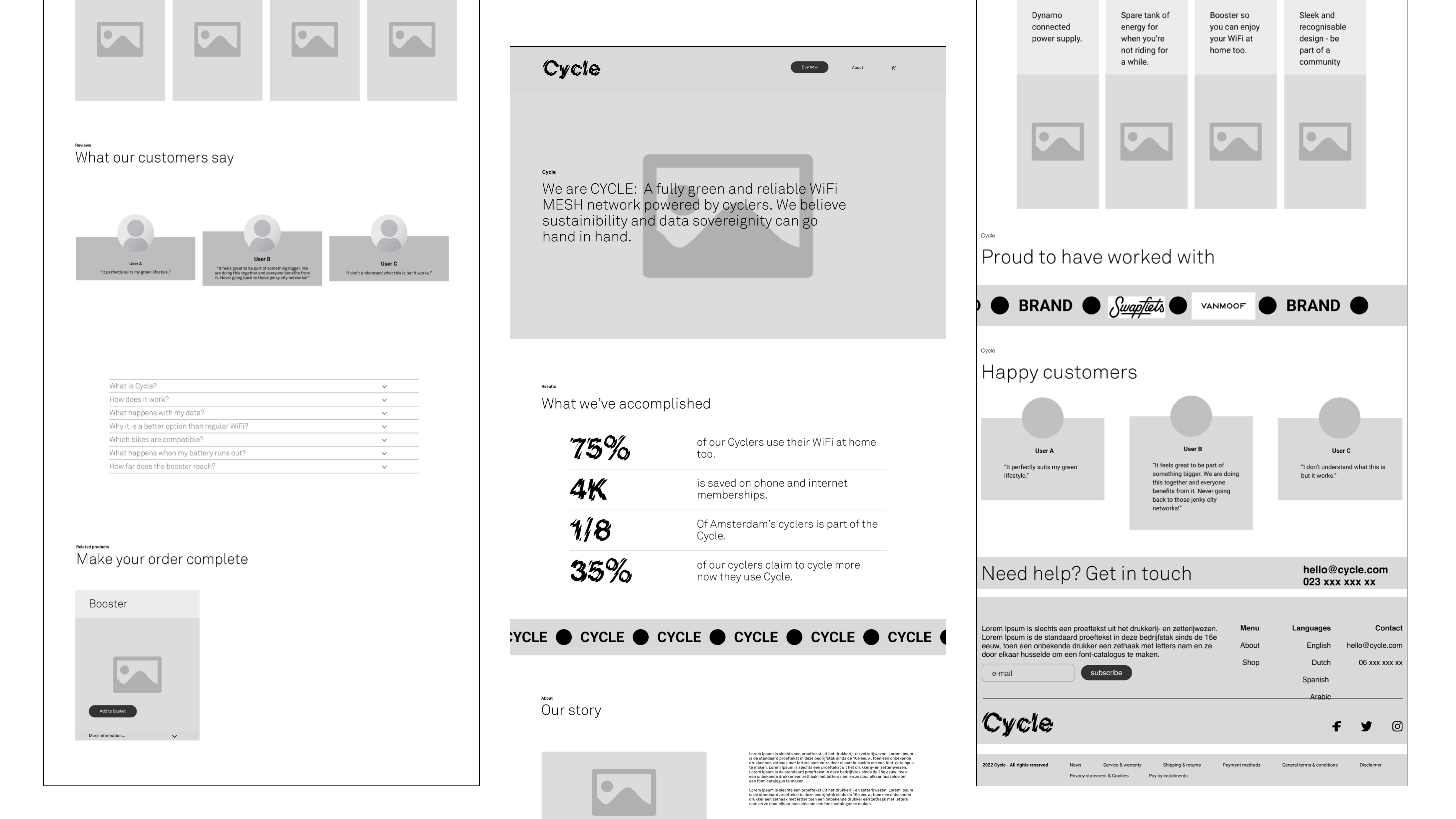
Wireframes & iterations
In this case study, I included two versions of the many wireframes I iterated.
The first thing that jumps out when comparing the two versions is the difference in margins, padding, and other whitespace. The second wireframe looks far more organized and is easier on the eyes.
Sometimes, there was too much text in one place, and I had to spread it out, as was the case with "Our Story." Other times, I completely redesigned a component, such as "Results." This component went from a card design to a text-based design, for the sake of variation. It was also a good opportunity to reintroduce the characteristic font of the brand.
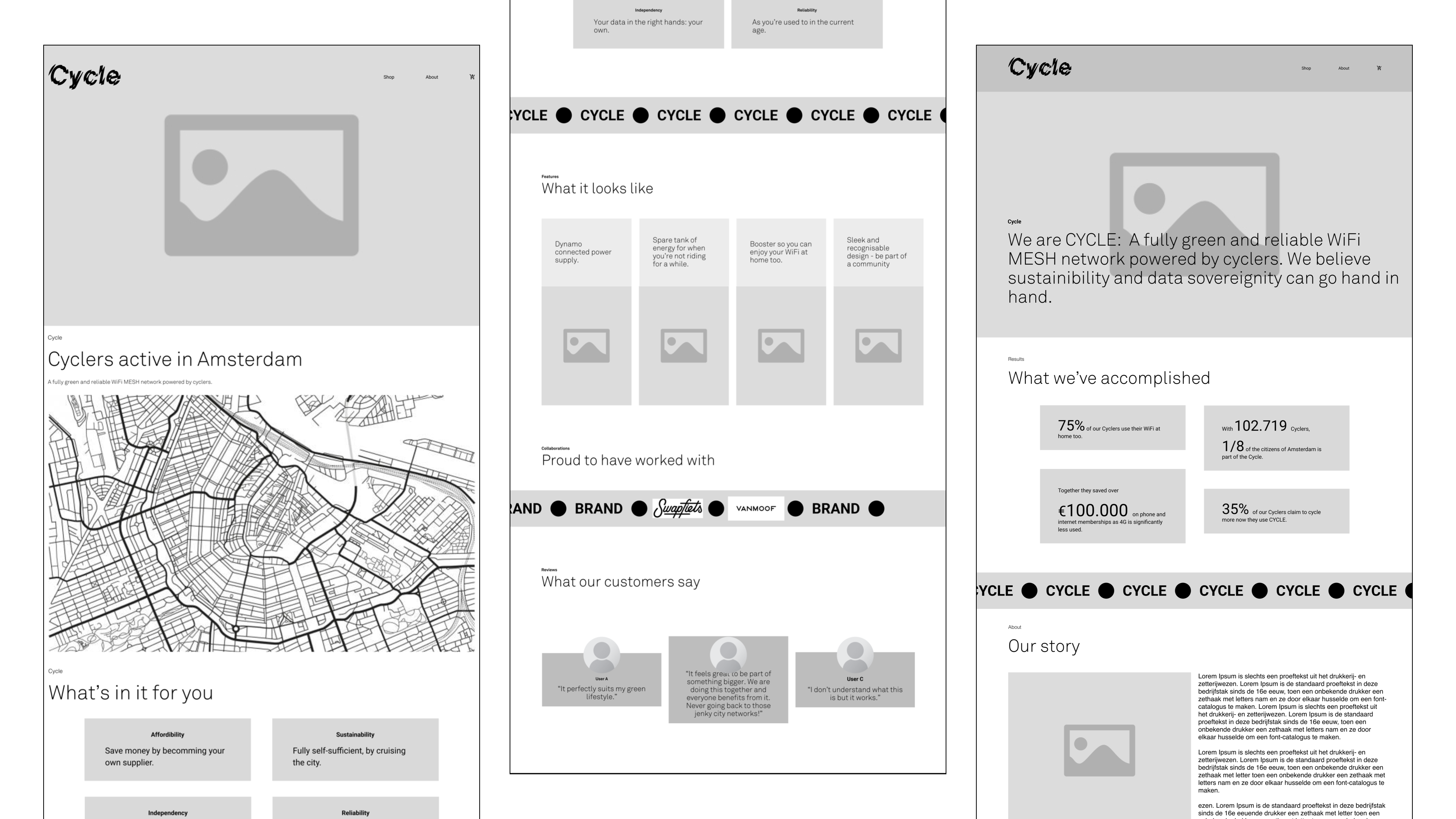
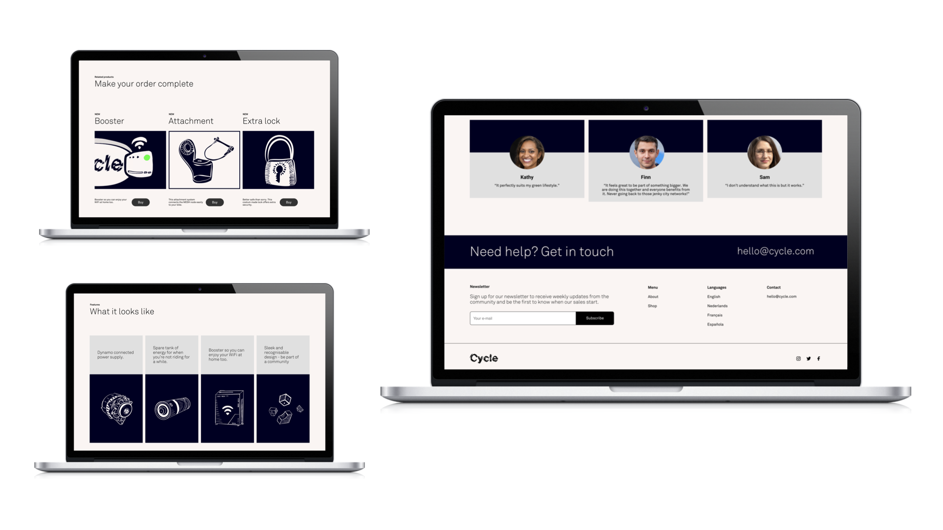
Final designs
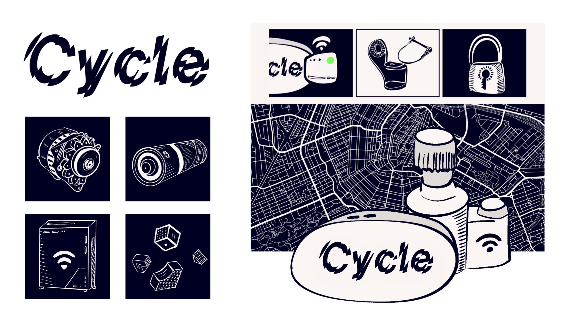
When putting in the content, I realized the design lacked images. I created more space for images in sections such as "Benefits." Another challenge was the fact that there was no content for the product, as it’s fictional. Therefore, I created illustrations of the product and all other related products. In the "Features" section, I saw an opportunity to include these illustrations as a visual aid for the text.