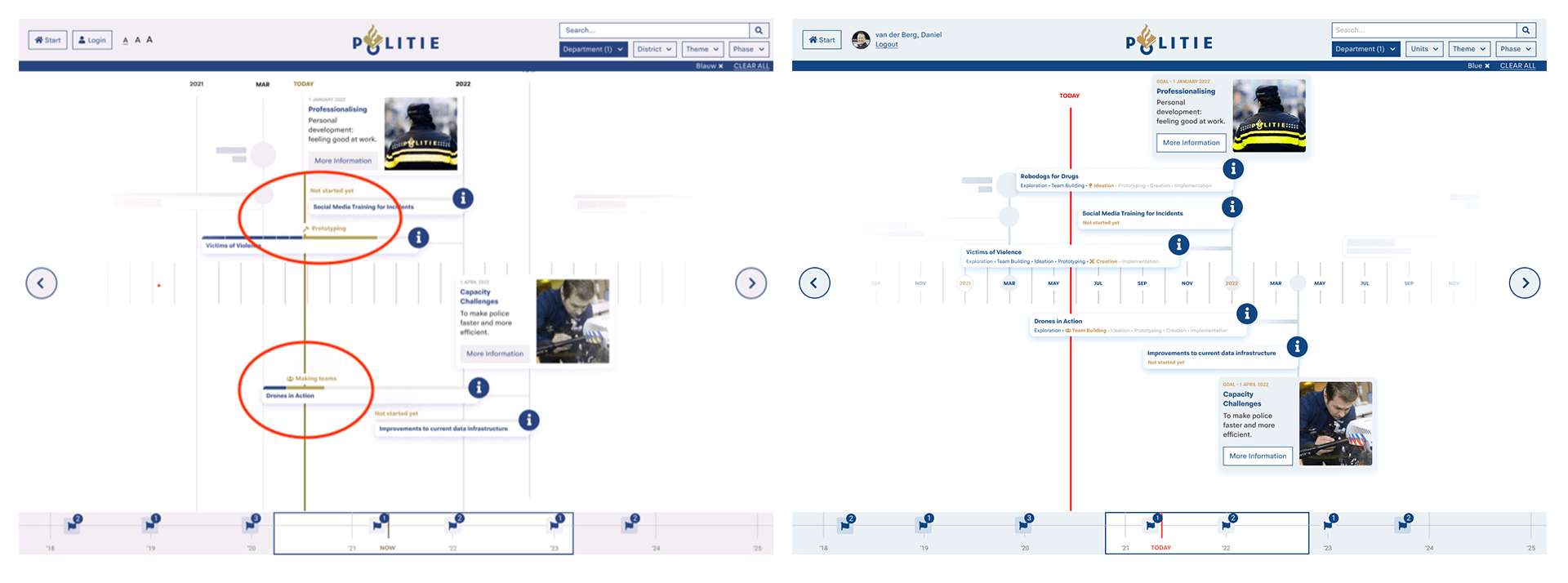
In a time in which it’s easier to steal your grandma’s data than her purse, the Police needs to innovate.
We created a digital space for innovation projects within the Dutch Police, whilst flipping the image of innovation.
Client
︎︎︎︎︎︎︎︎︎︎︎︎︎︎︎︎︎︎︎︎︎︎︎
Politie Nederland
︎︎︎︎︎︎︎︎︎︎︎︎︎︎︎︎︎︎︎︎︎︎︎
Politie Nederland
Expertise
︎︎︎︎︎︎︎︎︎︎︎︎︎︎︎︎︎︎︎︎︎︎︎
Co-design, UX / UI Design, Product Design, Concepting and Prototyping
︎︎︎︎︎︎︎︎︎︎︎︎︎︎︎︎︎︎︎︎︎︎︎
Co-design, UX / UI Design, Product Design, Concepting and Prototyping
CHALLANGE
With continuous development in (high-tech) crime, innovation within the Dutch Police is crucial. All innovation projects have something in common: they contribute to a theme. A theme is a goal with a deadline that the Police reaches by completing its related projects. However, these projects usually stay within their unit, which isolates them. This means that one unit starts to work on solutions that another department has already figured out.
We were asked to find a solution that centralises all innovation projects that are currently running within the Dutch Police. At the same time, we had to work on the image of innovation. From its current image - it costs too much money and it is too risky - to a new image: innovation is necessary and exciting.
EMPATHISING
Our empathise phase taught us that not everyone is keen to innovate, as the innovation department suffers from a bad image. Employees often think that it costs money, is risky, and doesn't improve their job directly.
Most of them are unfamiliar with innovation or are even opposed to it. This is because of the nature of the organisation, which is reactionary. When society acts, the Police responds. This means that there is no room for error, as errors have immediate consequences on society and civilian safety. Therefore we had the challenge to make innovation accessible and attractive.
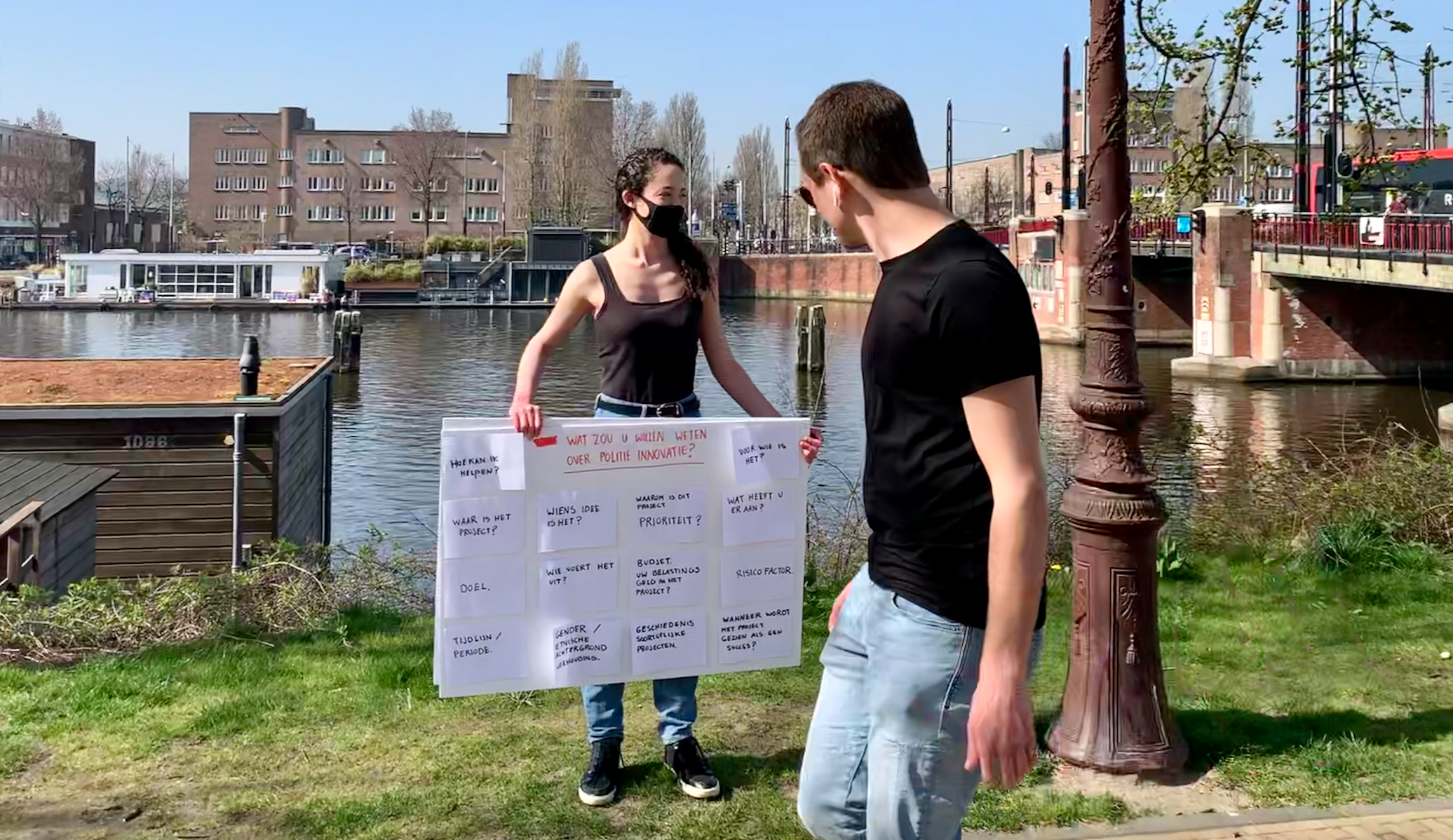
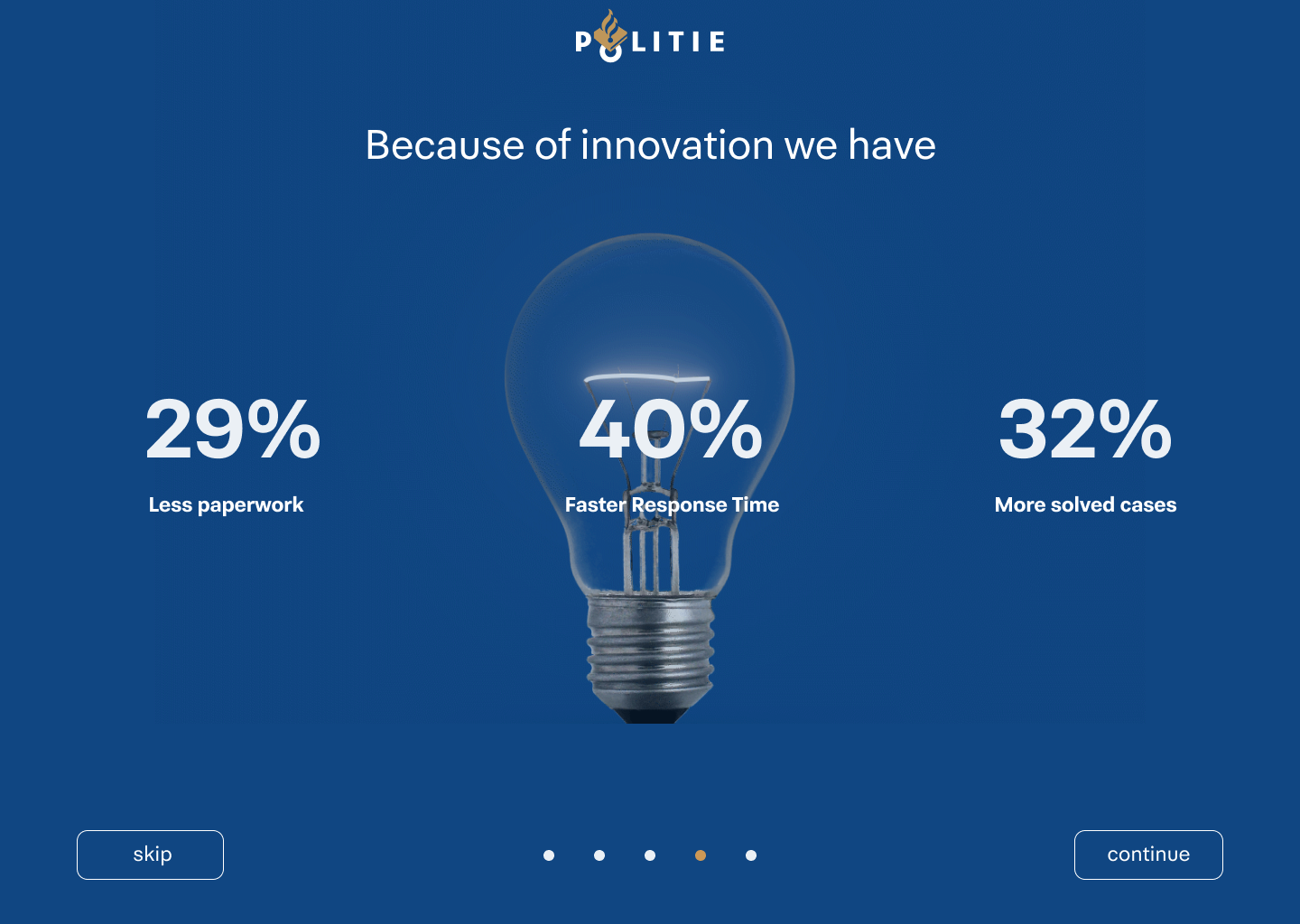
I interviewed and co-designing with people from all layers within the police and discovered that innovation needs storytelling to be understood. I decided to design a couple of screens that show the efficiently of innovation for the employees themselves. These screens are loaded in before the user enters the platform. Naturally, at some point the user is able to skip through them.
IMPACT MODELS
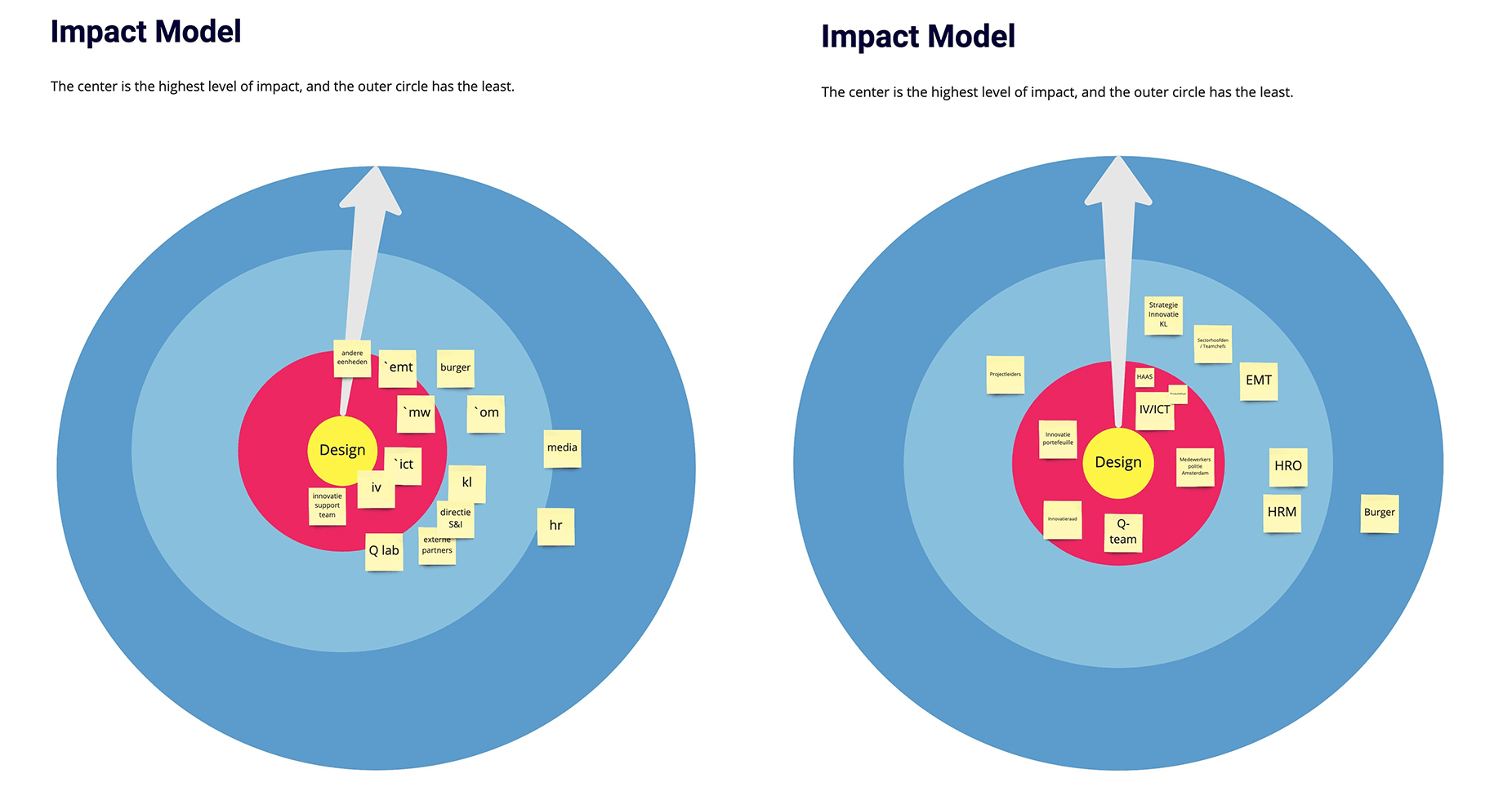
To understand the complexity of stakeholder layers, we asked our people of contact to fill in an impact model based on how helpful the potential solutions will be for departments.
STAKEHOLDERS
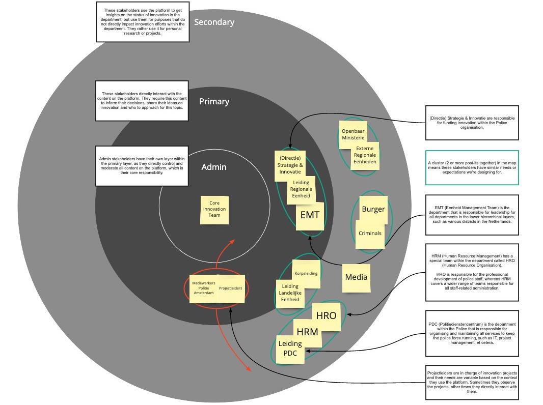
In an organisation consisting of 64.000 employees, the largest employer of the Netherlands, there are many stakeholders with different needs. One of our biggest challenges wasn't identifying all the stakeholders' needs but choosing which ones to fulfil. Besides that, it took us a long time to understand the police structure due to its complexity and size. A stakeholders map helped us with decision making.
FINDING DIRECTION
To understand the context of our brief and the organisation, we situated ourselves with our stakeholders and users. This allowed us to define what direction is necessary for our research and determine the problem correctly.
MoSCoW METHOD
The MoSCoW method helped us with prioritising features. Parallel, the police worked on another platform regarding innovation, and we had to make sure not to create overlapping features.

DATA VISUALISATION
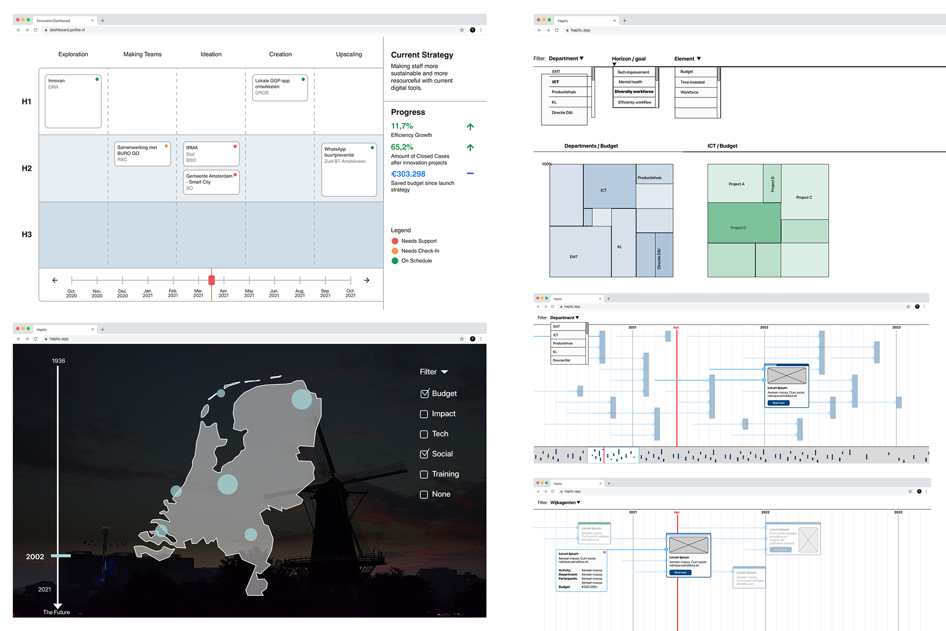
Our problem statements and client feedback let us experiment with different data visualisation methods to explore how to visualise the relationship between projects and themes.
FOUR CONCEPTS
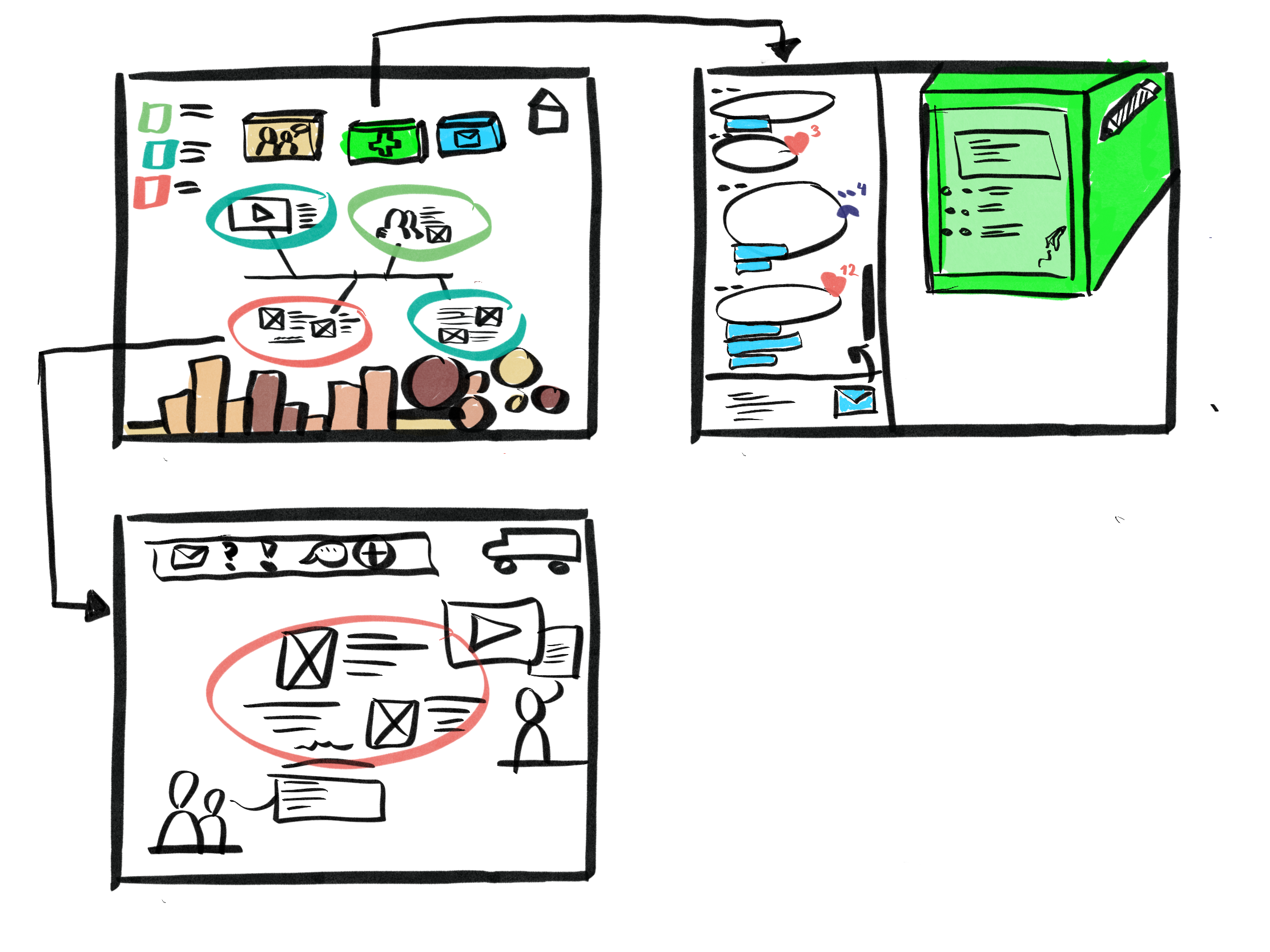
Because it was difficult for the client to communicate their needs, we crafted four concepts that could solve the problem space. They revealed that their preference was mainly the treemap view (upper right), and we decided to take this further.
Lo-Fi PROTOTYPE
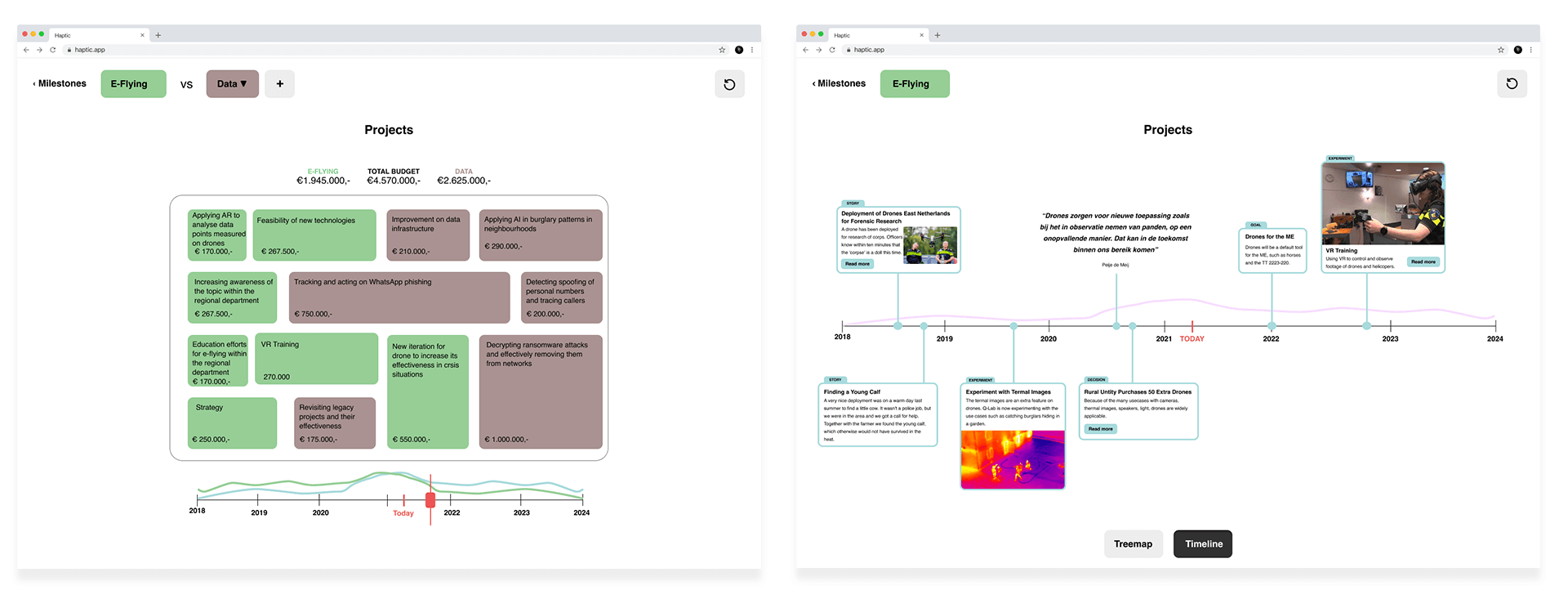
A lo-fi prototype helped us to identify the needs of the stakeholders. Management, and therefore our people of contact, had to desire to have a budget-focussed approach. However, we found out that at least 80% of the organisation doesn't value the budget-focused approach, and it doesn't solve the identified problem of the bad name of innovation within the Police. Therefore, we let them interact with a timeline view as well, as scientific research taught us that this is an effective way of storytelling. This interaction was much more appreciated. We took notes of the test and continued in this direction.

TIMELINE WIREFRAMING
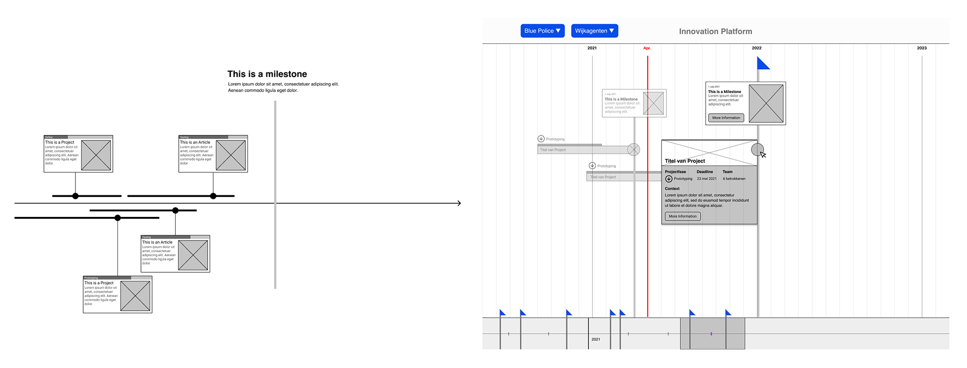
Heading into the direction of a timeline, we ideated how projects can correspond with themes in a time-based fashion.

TIMELINE Lo-Fi UI
After defining our concept, we made a lo-fi prototype to finetune the user experience.
PLATFORM
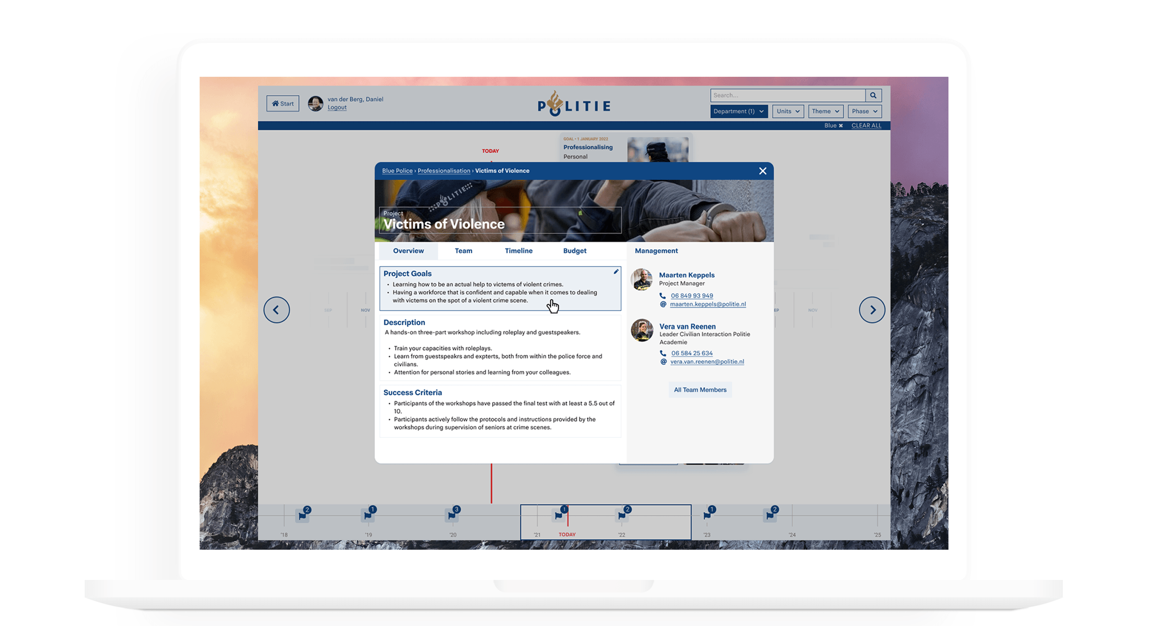
The result is an interactive platform that makes the status of innovation tangible with the help of storytelling and visualising the progress of innovation and its effects over time.
Projects & Themes
︎︎︎︎︎︎︎︎︎︎︎︎︎︎︎︎︎︎︎︎︎︎︎︎︎︎︎︎︎︎︎︎︎︎︎︎︎︎︎︎︎︎︎︎︎︎︎︎︎︎︎︎︎︎︎︎︎︎︎︎︎︎︎︎︎
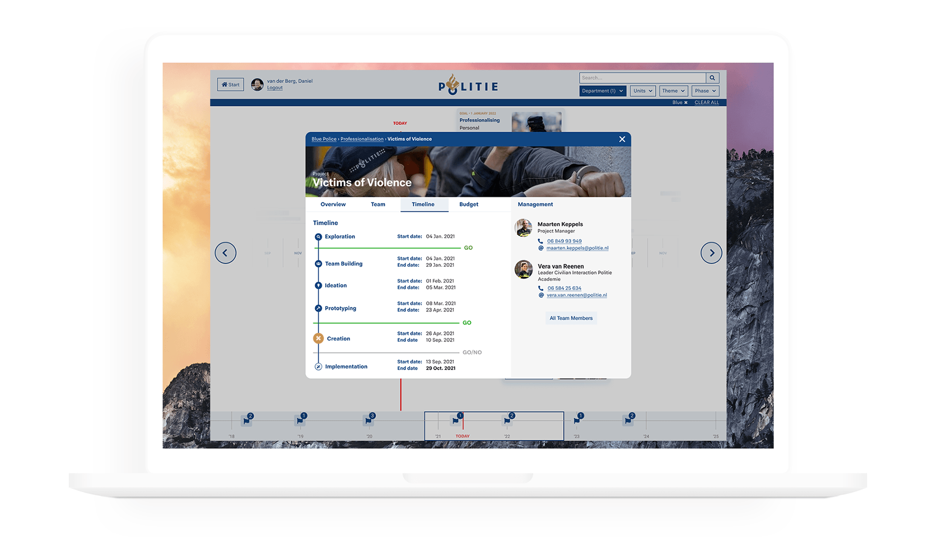
Themes are the overall goals of the innovation team. These themes overarch the projects and have their strategic goals and budget. Projects are what people are working on to meet the goals of its theme. This includes the outcomes of a project and the progress with GO/NO GO moments.
Team & Progress
︎︎︎︎︎︎︎︎︎︎︎︎︎︎︎︎︎︎︎︎︎︎︎︎︎︎︎︎︎︎︎︎︎︎︎︎︎︎︎︎︎︎︎︎︎︎︎︎︎︎︎︎︎︎︎︎︎︎︎︎︎︎︎︎︎
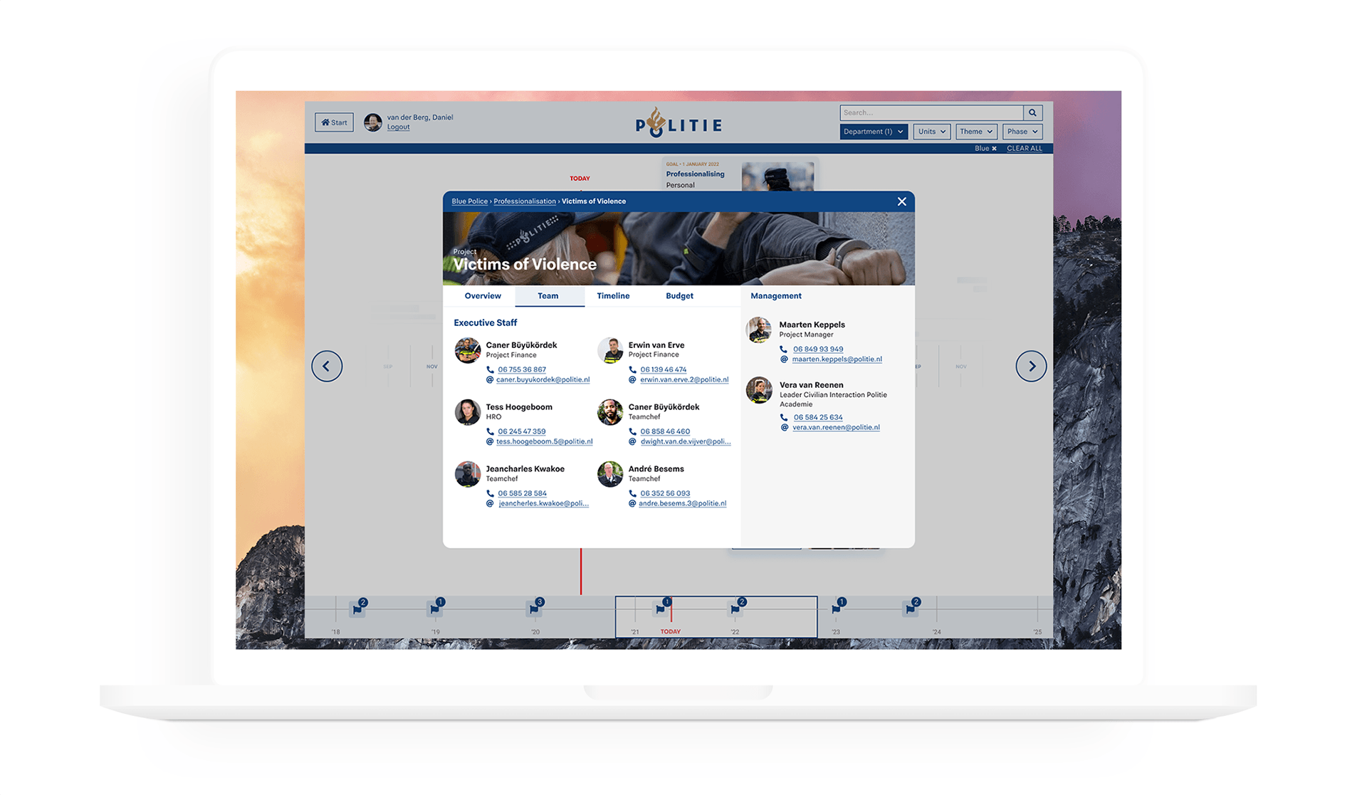
Projects that contribute to a theme reveal an overview and the team that is working on the project and their progress. This expanded progress information let managers and staff get a better understanding of innovation.
Budget
︎︎︎︎︎︎︎︎︎︎︎︎︎︎︎︎︎︎︎︎︎︎︎︎︎︎︎︎︎︎︎︎︎︎︎︎︎︎︎︎︎︎︎︎︎︎︎︎︎︎︎︎︎︎︎︎︎︎︎︎︎︎︎︎︎
For managers, we offer basic functionalities for strategic decision making, such as the designated budget for a particular project or goal and how much is spent.

Unit Focus
︎︎︎︎︎︎︎︎︎︎︎︎︎︎︎︎︎︎︎︎︎︎︎︎︎︎︎︎︎︎︎︎︎︎︎︎︎︎︎︎︎︎︎︎︎︎︎︎︎︎︎︎︎︎︎︎︎︎︎︎︎︎︎︎︎
To solve the problem of employees feeling that innovation doesn't help them in their job, we highly investigated in a dedicated filter.

Mobile
︎︎︎︎︎︎︎︎︎︎︎︎︎︎︎︎︎︎︎︎︎︎︎︎︎︎︎︎︎︎︎︎︎︎︎︎︎︎︎︎︎︎︎︎︎︎︎︎︎︎︎︎︎︎︎︎︎︎︎︎︎︎︎︎︎
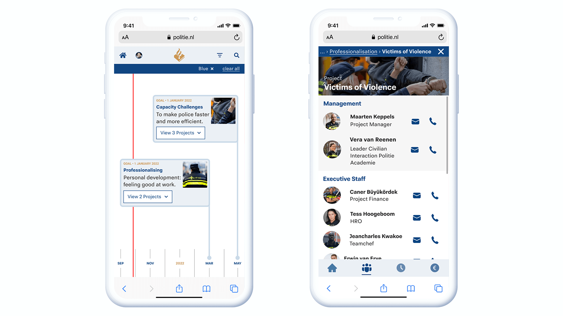
For the officers on the street, a mobile version of the platform is convenient.
Admin
︎︎︎︎︎︎︎︎︎︎︎︎︎︎︎︎︎︎︎︎︎︎︎︎︎︎︎︎︎︎︎︎︎︎︎︎︎︎︎︎︎︎︎︎︎︎︎︎︎︎︎︎︎︎︎︎︎︎︎︎︎︎︎︎︎
Admin users work for the innovation team, who have the desire to add and edit the platform's content.
Inclusive Design
︎︎︎︎︎︎︎︎︎︎︎︎︎︎︎︎︎︎︎︎︎︎︎︎︎︎︎︎︎︎︎︎︎︎︎︎︎︎︎︎︎︎︎︎︎︎︎︎︎︎︎︎︎︎︎︎︎︎︎︎︎︎︎︎︎
In our mid-fidelity design, we made a progress bar and floating text. However, it didn't work once I tested the design on the colour blindness condition Protanopia. The red line and golden text made it difficult to read the words and understand the progress bar. Therefore, we redesigned this element.
